Responsive Web Design – Mobile Compatible and User Friendly Websites
Responsive Web Design is an approach developed to make your website look and feel seamless on both desktop and mobile devices. With the increasing use of mobile devices, mobile-friendly designs have become not only a trend but also a necessity that improves the user experience. As Meditory Agency, we design mobile-friendly and effective websites that attract the attention of users with solutions specific to your business. Here are the details of our responsive web design service:
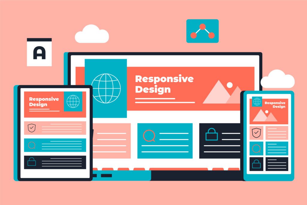
1. Flexible and Adaptable Design Structure
With responsive web design, your website automatically reorganizes according to the screen size and offers users the best experience. This flexibility ensures that your site is accessible and usable on different devices.
– Flexible Visual and Grid Systems: Images and content are resized according to screen size and optimized for the resolution of the device.
– Mobile, Tablet and Desktop Compatible Designs: Your design becomes accessible on any device without compromising the user experience.
2. User Experience Oriented Mobile Compatible Designs
Mobile-friendly design allows users to navigate the site quickly and smoothly. A user-friendly website increases users’ loyalty to your brand and extends the time they spend on your site.
– Simple and Clear Navigation: Easy-to-navigate menus allow users to quickly access the information they need.
– Fast Load Time: Mobile-friendly sites are optimized for speed, which positively affects the user experience.
– Optimized Images and Content Layout: Visuals and content layout suitable for mobile screens enrich the appearance of your site and increase readability.
3. Impact on SEO and Google Rankings
Responsive web design is a feature favored by Google’s ranking algorithms. Having a mobile-friendly site improves your search engine rankings and drives more organic traffic.
– Mobile-Friendly and SEO Integration: Google gives higher rankings to mobile-friendly sites, which increases your business’ online visibility.
– Lower Bounce Rate: A site optimized for users accessing from mobile devices contributes positively to your SEO performance by reducing the bounce rate.
4. Advanced Conversion Rates
A mobile-friendly design keeps visitors on your site longer and makes them more likely to convert into leads. With a user-friendly experience, visitors will navigate more pages and your conversion rates will increase.
– Higher Accessibility: Seamless access from any device helps you reach more visitors and increase the conversion rate into leads.
– Easily Accessible Call to Actions (CTA): Mobile-friendly sites include effective CTA buttons where users can quickly get in touch or request your services.
5. Testing and Performance Optimization
As Meditory Agency, we test our responsive designs to ensure device compatibility and maximize performance. We test your site on different screen sizes and devices to maximize user experience.
– Multi-Device Testing: Your website is thoroughly tested to be compatible on all devices.
– Performance Optimization: We offer the best experience by analyzing factors such as page load time, visual and content optimization.
With Meditory Agency’s responsive web design services, we create user-friendly and SEO compatible websites that work flawlessly on every device. We take your business one step ahead in digital with flexible structures targeting mobile users.


